
Informative website, survey and data visualization
Commissioned by: The Undersecretary of Regional Development (Ministry of the
Interior and Public Security of Chile)
A platform to engage Chilean citizens in discussions about the
decentralization process.
Give back to the citizens and make their voice heard
The government often opens participation opportunities, but
rarely ever informs the citizens of the results of these
instances of participation.
The team had to work
in a two part project, first an informative website aiming to
engage the citizens in participating in a survey on
decentralization topics, and second a data visualization for
the results of the survey and qualitative data gathered in the
in-person participation instances.
I led the design process of the website and survey experience
between April 2023 and July 2023 as the only product designer
in the team. The data visualization part of the project is
still work in progress.
Along side the dev team, I collaborated with a team
of sociologists, public administrators and political scientists
who provided content, insight and the requirement details. The
marketing graphics were provided by the communications team in
the undersecretary, as well as the UI kit in use belongs to
digital.gob.cl (no longer available).
Frontend: Rosario Amunátegui, Veronica Caro
Backend: Jaime Hernández
Ops: Paul Eaton
Product Design: Teresa Peña
Frontend: J.I, Paul Eaton
Backend: J.I
Ops: Paul Eaton
Product Design: Teresa Peña
Most citizens are unaware of how this process shapes their lives or influences the way regional authorities fulfill their responsibilities.
How can we make them complete a survey?
Given the topic and the level of interest expected from our future users, the design had to follow a few principles:
- Ensure that the platform’s message was accessible to a diverse audience.
- Balance informational content with user-friendly design.
- Encourage participation in the survey by making it central to the site.
How these principles reflected on the website
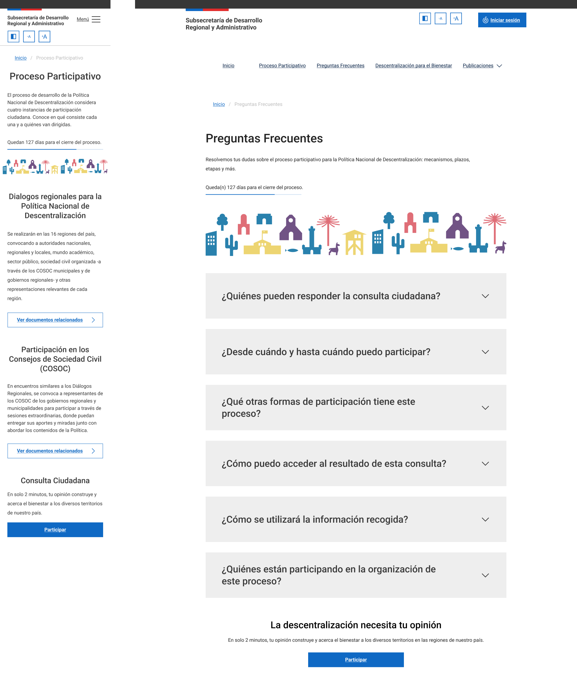
Transforming awareness
Recognizing that the survey was the primary interaction, we
made it the focal point of the homepage. The call-to-action
was prominent, with clear instructions and minimal
distractions, encouraging users to participate.
_UzjOnst_NZ_YKx-wBANjq.png)
A secondary CTA was added on the more content-heavy parts of the website to encourage users who chose a different path.
The undersecretary team was very excited to put information out there to inform citizens about the process. I took that content and put it in a more legible way, not only to fit devices with smaller screens but to make it more appealing and easier to digest.
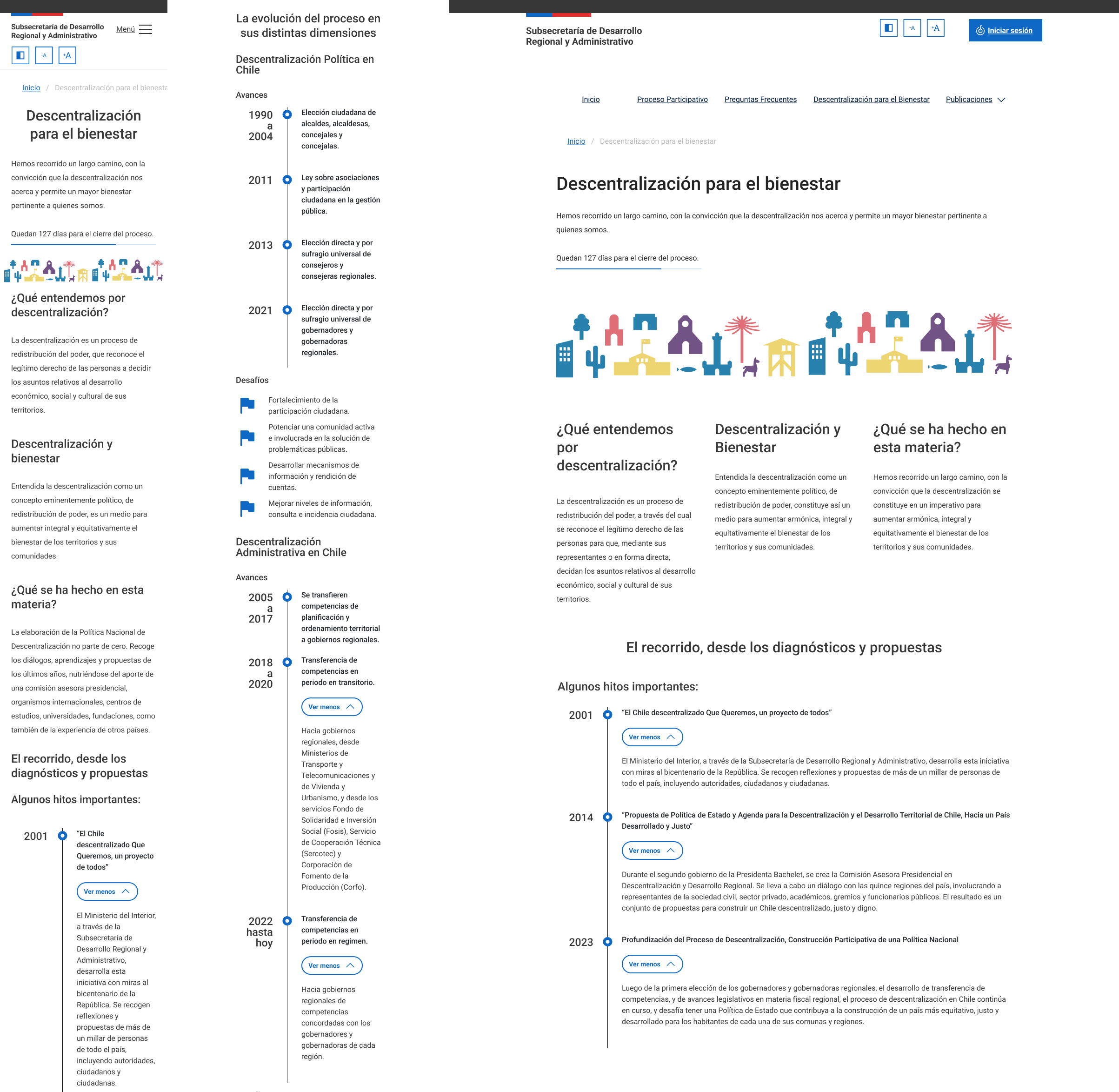
I employed a strong visual hierarchy that emphasized the most
important details. Key messages were presented upfront,
supported by secondary content that users could explore at
their own pace.
This approach maintained the richness of
information while allowing users to engage with the content on
their terms.
How these principles reflected on the survey
Guiding the journey to completion
I focused on creating an experience that felt approachable and manageable for users. The onboarding played a crucial role in setting expectations, explaining the nature of the questions they would encounter and easing any potential apprehension.
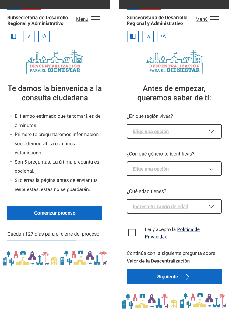
After the onboarding, every "next step" was described before the user jumped to it. By offering clarity upfront, I reduced dropout rates and ensured that users felt prepared and confident as they progressed through the survey.
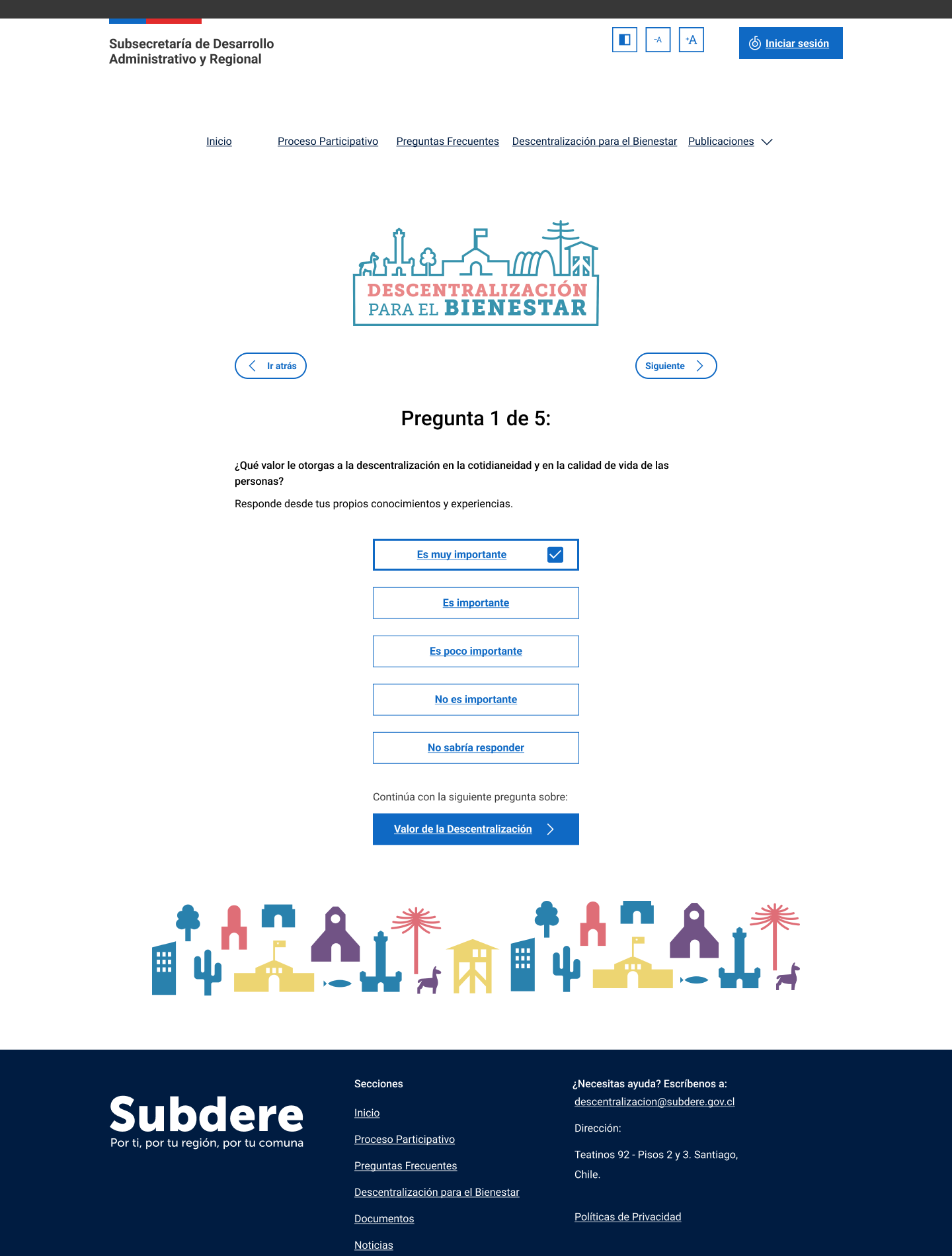
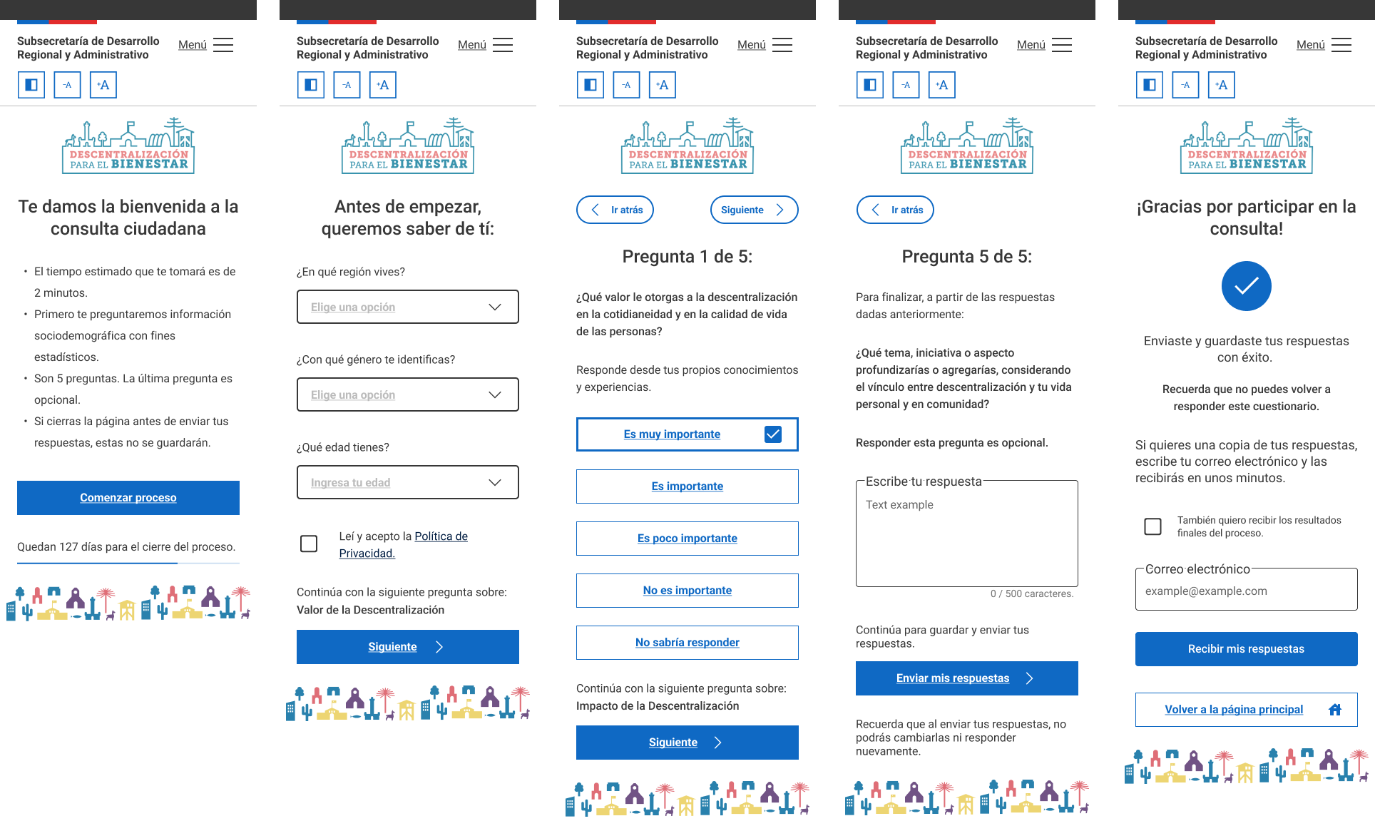
We designed the survey with a clear, structured flow, ensuring
that users could easily navigate through the four required
questions.
When we needed a long-form answer or
asking for their email to send them their answers, I suggested
to make these inquiries optional for the user, this
flexibility made the survey feel less demanding while
maintaining the integrity of the data collected from the
required questions.
The impact
From onboarding to completion
Despite the challenges of engaging users in a complex topic like decentralization, the survey achieved remarkable engagement once users committed.
The onboarding pre-questionnaire effectively set the stage, guiding users through what to expect and establishing trust. This approach ensured that those who continued were highly engaged, leading to near-perfect completion rates in subsequent questions.
97.5%
average completion rate
through the survey.
- People from 14 to over 75 years old were able to complete the survey.
- Every region of the country was represented in the answers covering almost 90% of communes.
- All indigenous peoples and other minorities were represented in the answers.
One very important detail despite the near-perfect engagement
throughout the survey, was the fact that users needed their
personal digital ID to authenticate, and not everybody has it
at hand while using their phones, or devices at work for
example. Which made the website lose potential conversions
significantly.
This point could have been improved
communicationally, since we can't divert from using the
official authentication method.